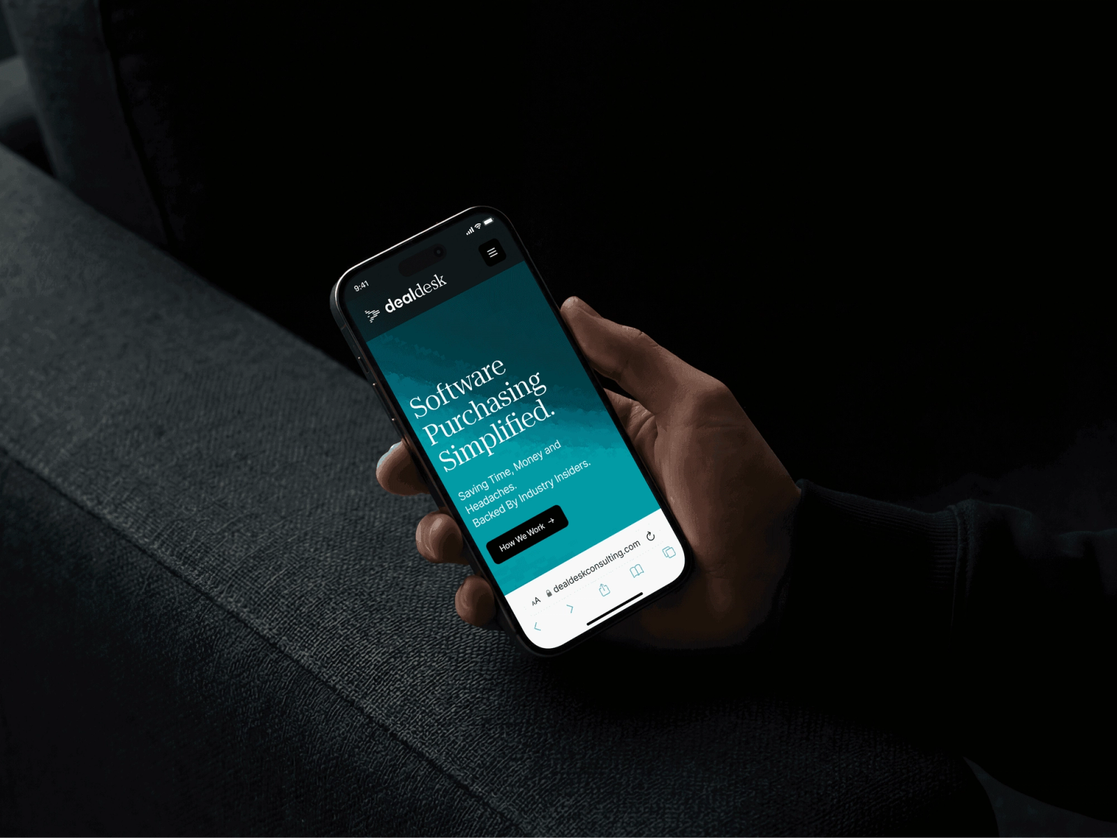
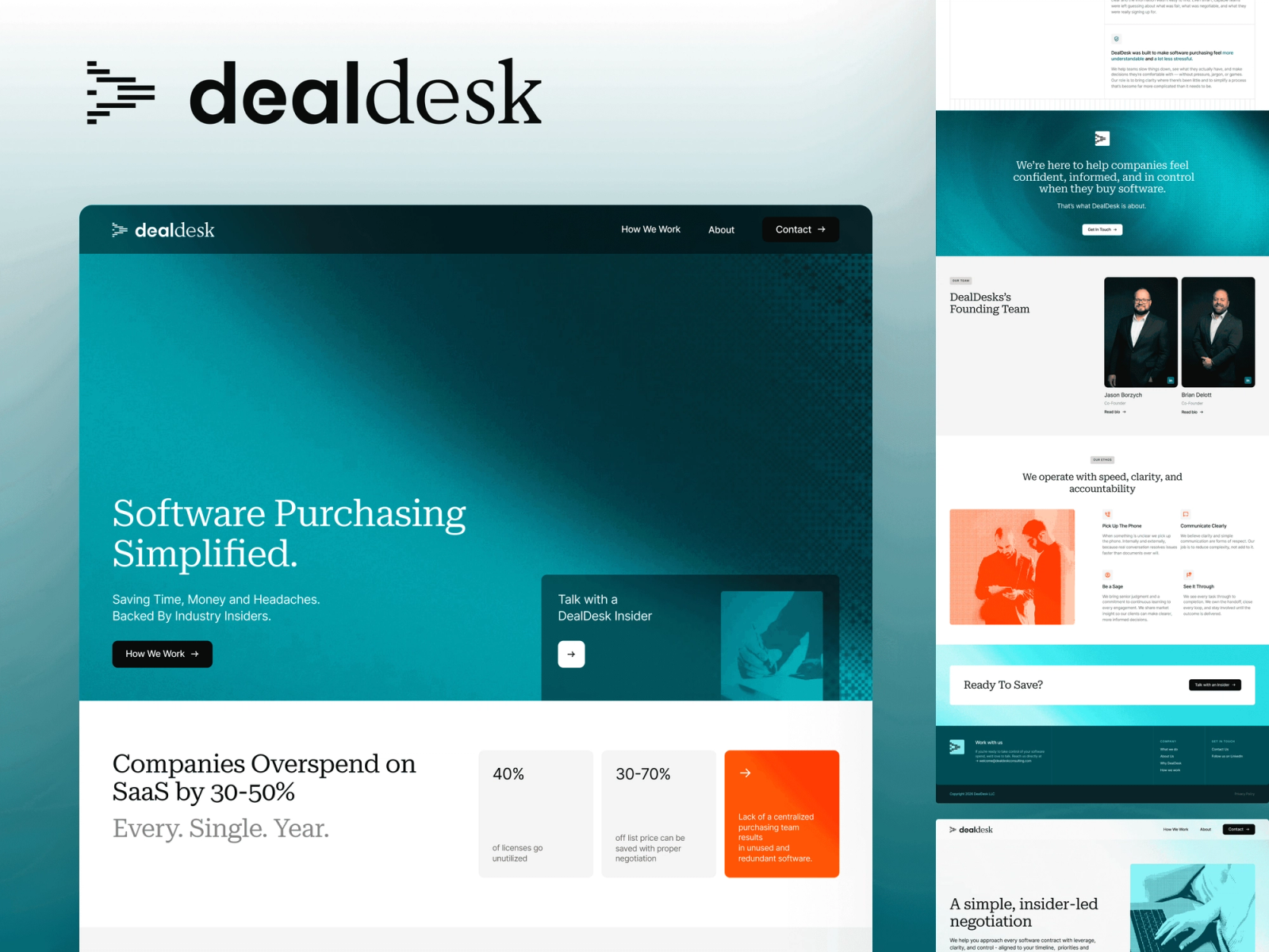
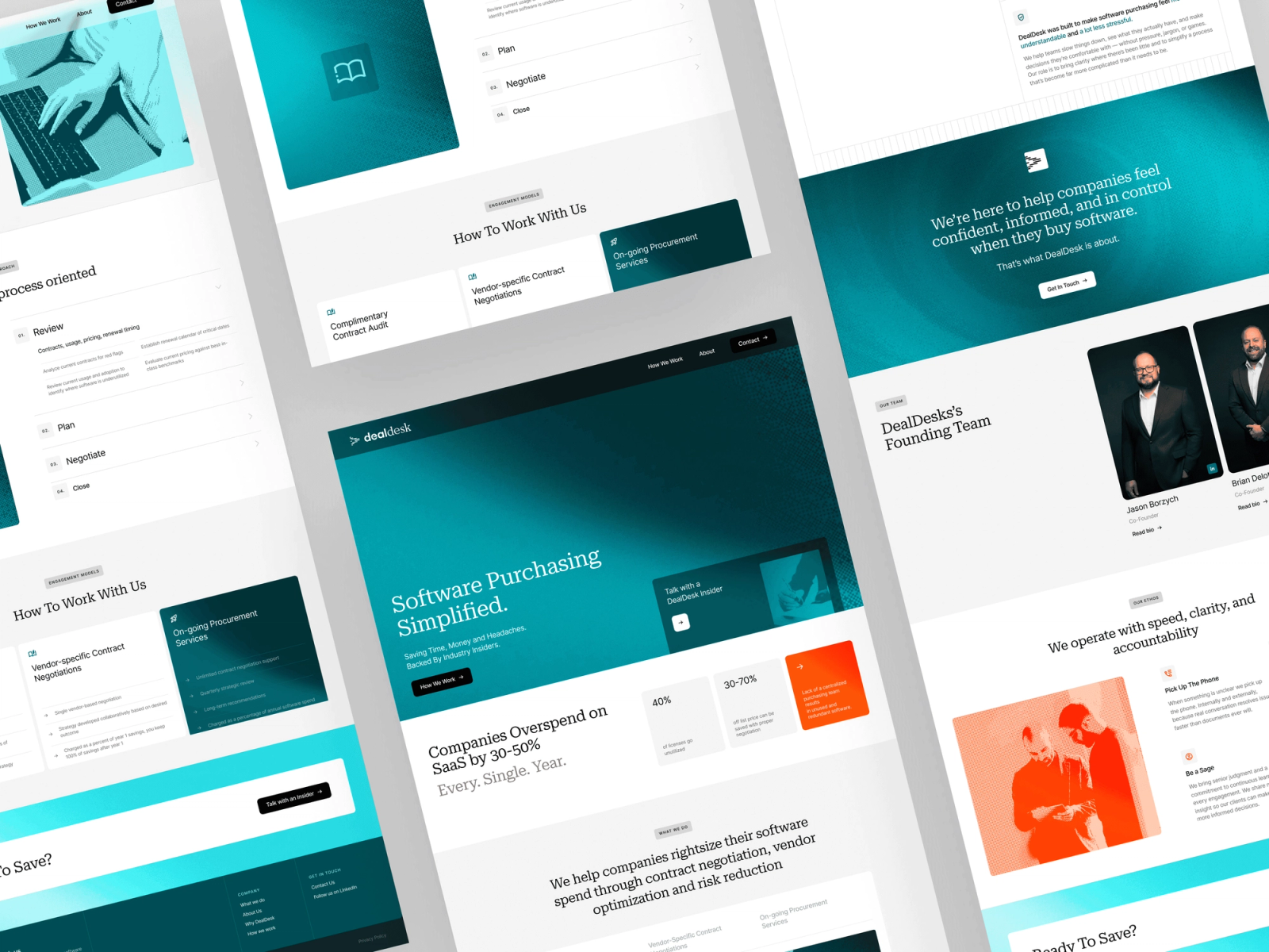
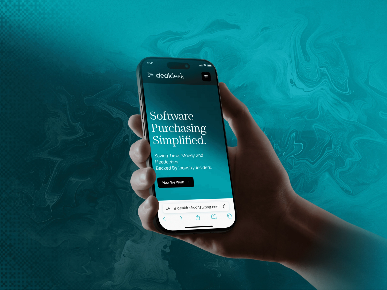
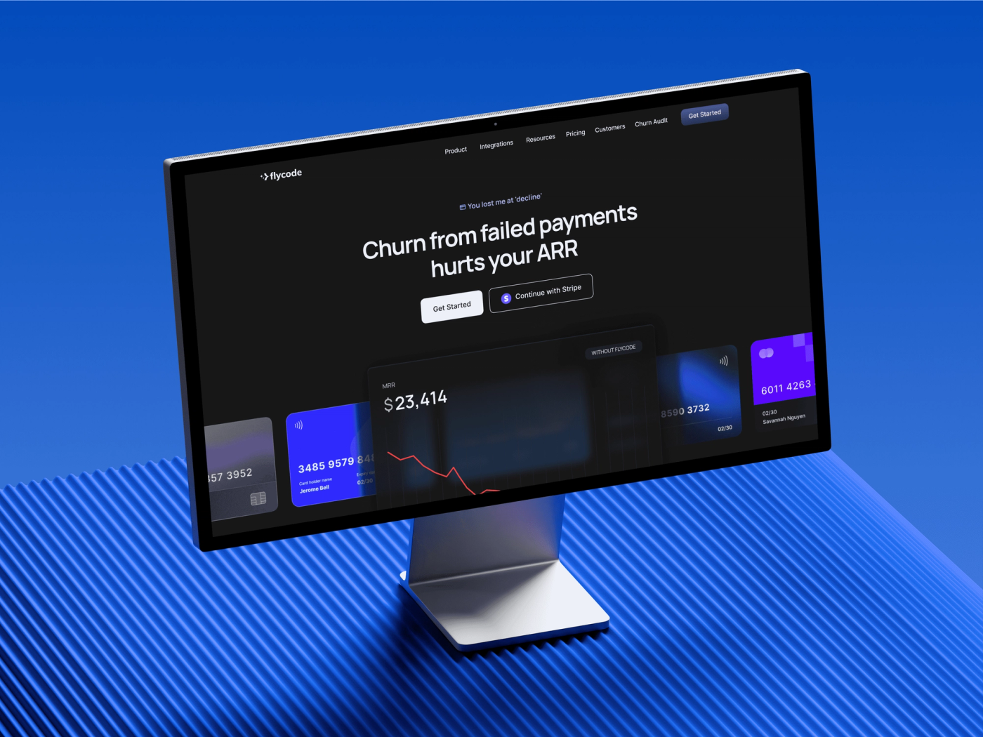
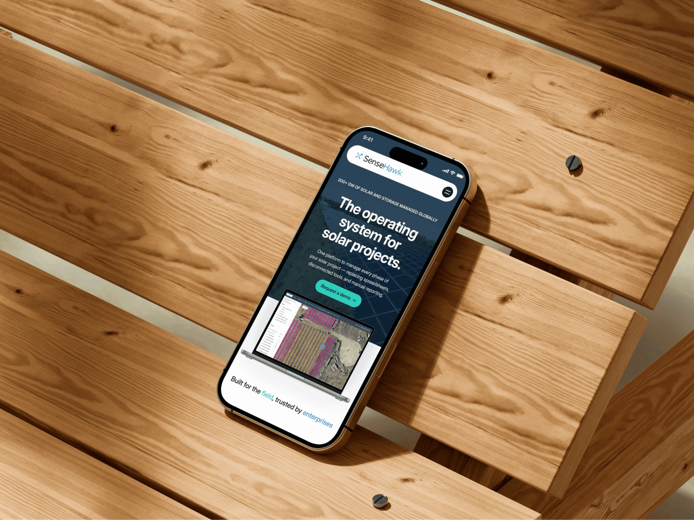
Faithful to the file, finished in the browser
Before building, we audited the Figma files and came back with recommendations to enhance the design, not change it: spacing turned into a system, smooth transitions where the file showed static hovers, and mobile layouts where none were defined. Then we matched every color, font size and spacing value of the navy and cream design, and added what only shows up in a real browser: scroll-triggered reveals, subtle parallax on the hero and custom interactions on buttons and cards.
The Figma to Framer conversion ran on daily milestones across the homepage and the How We Work, About and Contact pages, with responsive development and testing built into the plan and feedback batched into two review rounds. SEO went in alongside: semantic HTML, meta tags on every page, image alt text, Open Graph tags and a clean sitemap.