A brand and site for an agency positioned against agency economics, built to read like an operator essay, not a brochure
Client
Digital Guild
Industry
eCommerce Marketing Agency / Private
Services
Brand Identity, Website Design, Framer Development, Copy Refinement, Editorial Data Visualization, SEO
Tech stack
Framer, Inter Tight / Inter, Custom SVG Charts, Calendly, Gated + Ungated Resources
Year
2026

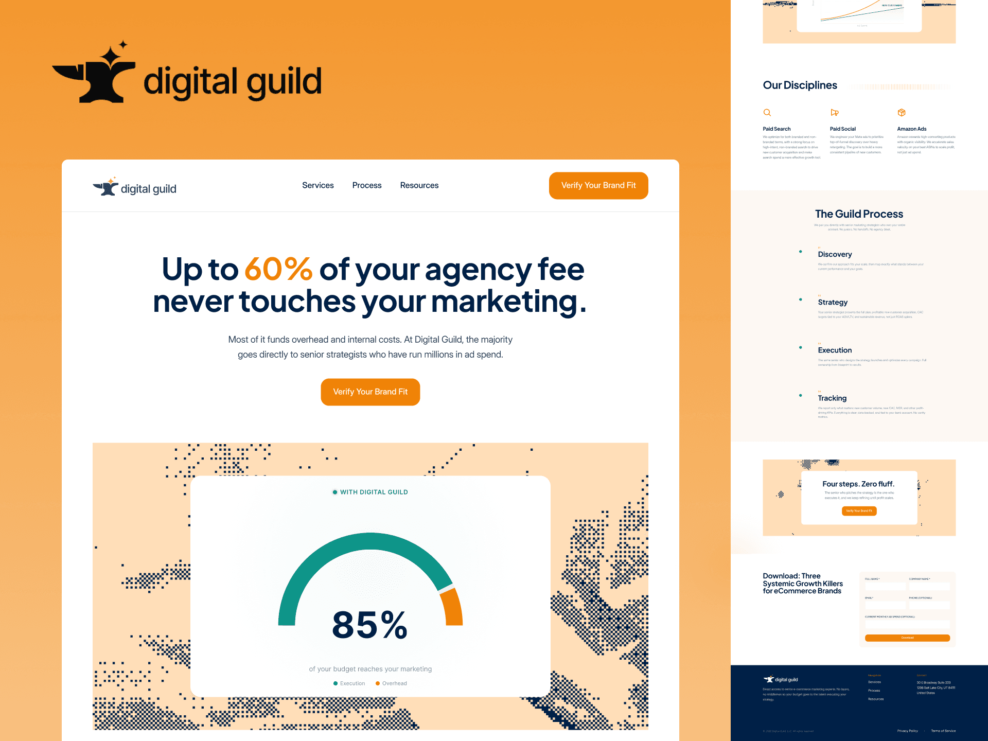
AGR Studio built the brand identity and Framer website for Digital Guild, a senior operator eCommerce paid media agency, a site that reads like a manifesto.
Digital Guild is a boutique eCommerce paid-media agency, Paid Search, Paid Social, Amazon Ads, built around a single structural constraint: no junior account managers, no layered overhead. The founder came to us with a pointed thesis and a stat to anchor it: up to 60% of a typical agency fee never touches the client's actual marketing. It funds internal overhead.
The job was to turn that thesis into a brand and a site credible enough to convert the informed buyer, a DTC operator who already understands CAC, ROAS, and MER, and is tired of being sold to. No stock imagery. No testimonials they didn't have yet. No team page. Just the argument, told well.
Positioning the thesis. We spent the first phase sharpening the claim: senior operators only, no junior account managers, no layered overhead. We mapped the agency economics argument into a site narrative, defined the two page structure, and wrote the positioning line by line with the founder so every section reads like a manifesto instead of a service list.
Brand System
Carbon Navy (#2C3E50) as the primary, Ochre (#D97706) as the single accent, paired with Inter Tight for headlines and Inter for body. The result is austere and typographic, closer to a research publication than a services brochure. We explicitly rejected imagery as a crutch.
Editorial Data Visualization in Place of Testimonials
Because Digital Guild didn't have a public case-study roster or testimonials yet, we needed another form of proof. We designed a proprietary chart system, a ROAS-vs-Ad-Spend peak-decline curve and a twin
Two Pages, One Argument
The entire site is two pages, Home and Resources, because the argument didn't need more surface area. The homepage is a single anchor-scroll essay with five movements: traditional-agency fee comparison, why ROAS optimization fails, sustainable growth drivers, disciplines (Paid Search, Paid Social, Amazon), and the four-step Guild Process (Discovery → Strategy → Execution → Tracking).
One Conversion Action
No newsletter form. No contact page. No
Digital Guild launched with a site that argues for itself. No social proof, no case studies yet, no team page, just a thesis delivered with the density and confidence of a POV essay. It reads the way the service delivers: direct, numerate, no filler.
The IA is intentionally minimal (two pages), the conversion path is a single qualifying action, and the proof layer is editorial data visualization the team can keep updating as campaigns run. Every decision on the site reinforces the central claim, that senior operators executing directly beats layered agency teams, including the decision to say less.
2
Pages
4
Feedback Rounds
1
Conversion Actions