Quiet confidence on every page
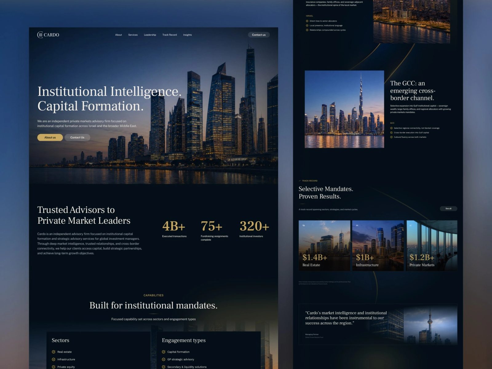
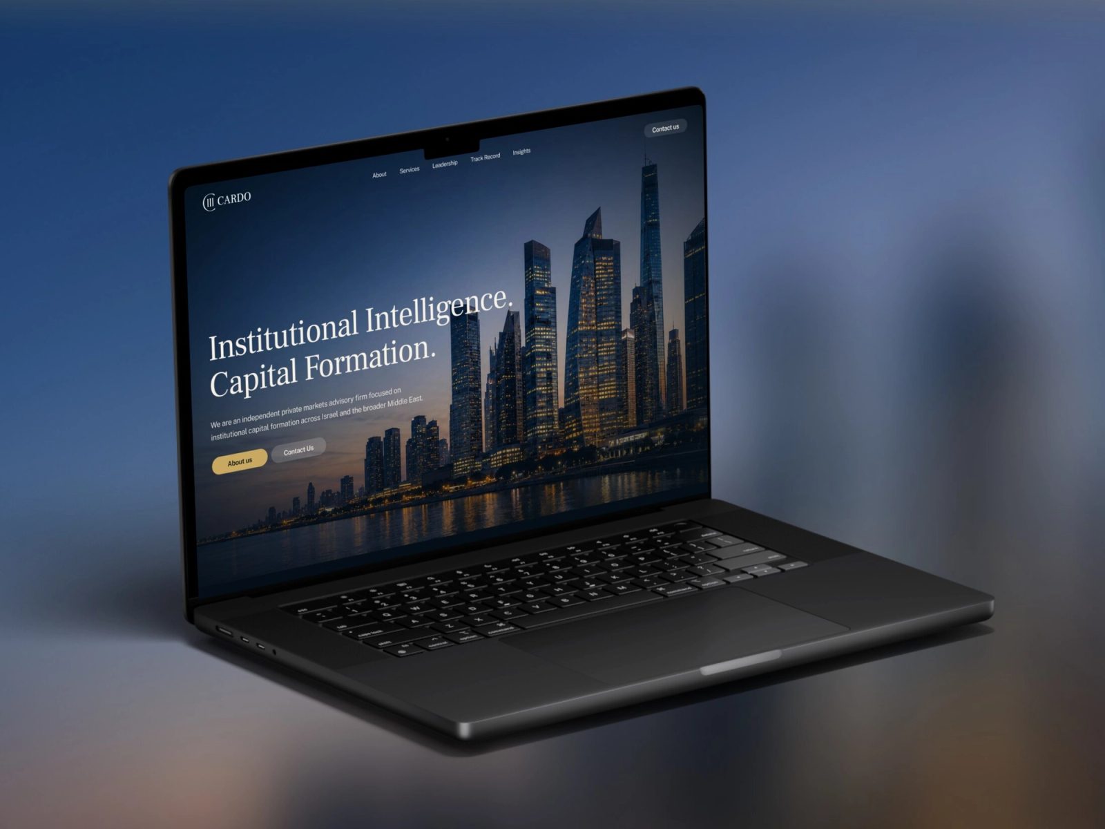
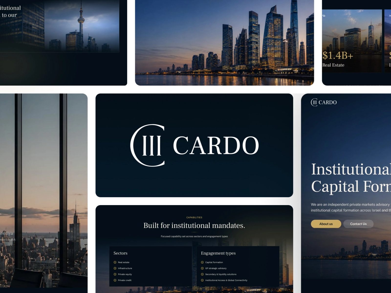
The brand direction is deliberately restrained: a near-black canvas, off-white type and one gold accent used sparingly. Frank Ruhl Libre, a serif with Israeli heritage, pairs with Public Sans for a tone that feels rooted and global, alongside a custom monogram and architectural, dusk-lit imagery that signals scale without handshake clichés. Generous whitespace, gold hairlines and sharper copywriting make the long pages read like a point of view, not a sales deck.
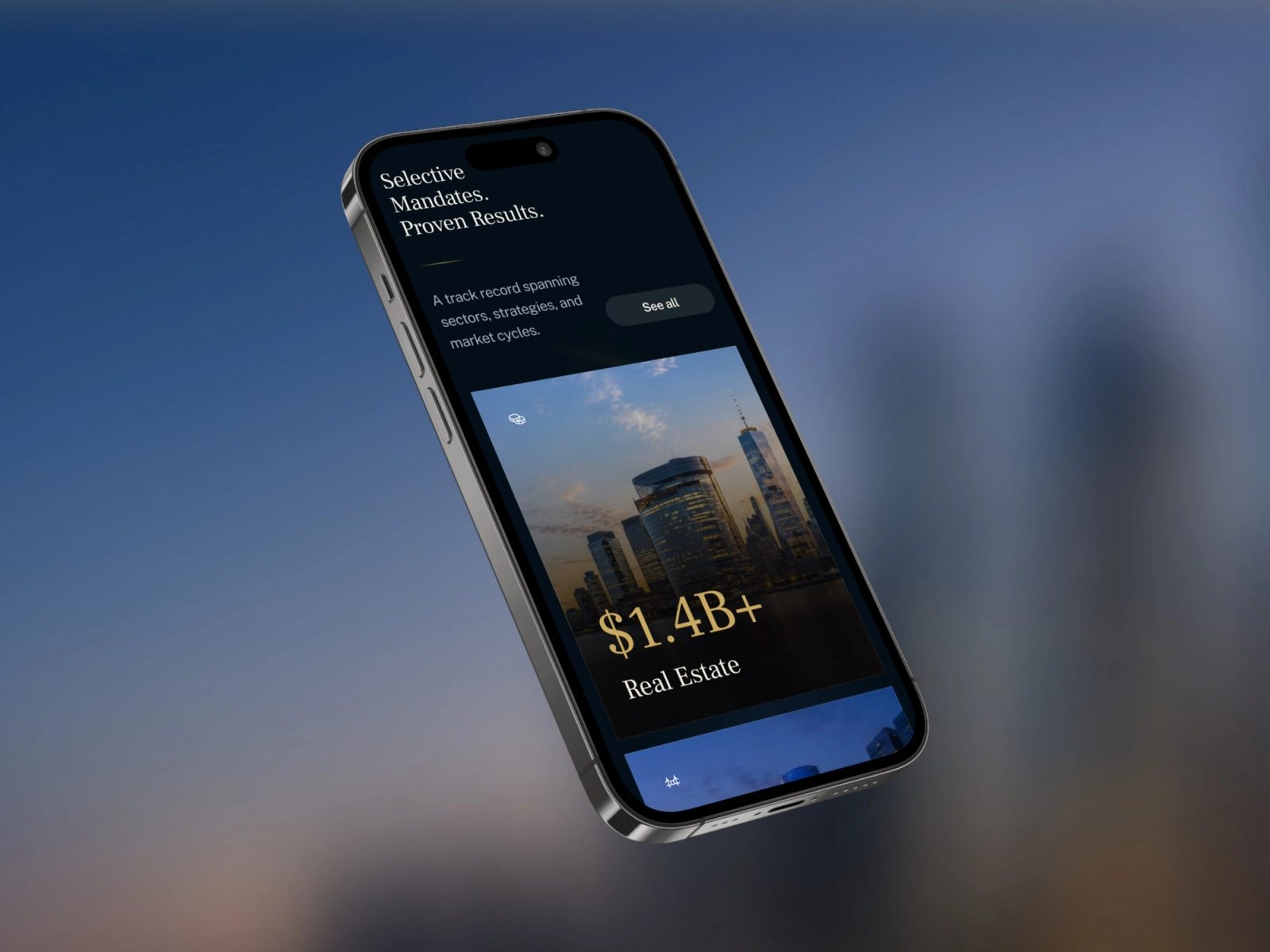
We rebuilt the financial services website from the ground up in Framer, on a CMS architecture of six collections: Services, Track Record, Leadership, Perspectives, Categories and Legal. They power dynamic pages and bespoke sections, from an animated stat band and asset-class track-record cards to a leadership profile with an advisory-network module, so the site stays current with no development work. Ten real client logos were rebuilt as clean white SVGs for a credibility wall, and the Perspectives feed launched with market intelligence and deal announcements already in place.