Bitcoin Website Design: Building Trust with Institutional Buyers
- Category:
- Strategy
- Updated:
- Oct 11, 2026
Ask AI about this article
Lessons from Finite’s brand and Framer website: how to explain complex services, build a distinctive identity and guide institutional buyers into a conversation.
 Artyum Grebenyuk Founder, AGR Studio
 A Bitcoin business needs a website that makes its role in the market easy to understand. A decision-maker should be able to identify who the company serves, what it offers and why its expertise is relevant before booking a conversation.
That was the brief behind AGR Studio’s work with Finite, a business spanning talent, Bitcoin intelligence and treasury advisory. The following lessons come from the founder’s feedback and the decisions we made together during the brand and website project.
View the Finite brand and website case study
1. Make the commercial offer clear
Start with a sentence that names the audience and the work. If the business offers several services, explain what connects them and give each a clear role. An impressive category label still needs plain-language support underneath it.
For Finite, talent was the foundation, but intelligence and treasury advisory also had to stand independently. We organised the site around its place in the Bitcoin ecosystem, then its sectors and capabilities. This gave the wider offer a clear structure.
2. Build the visual identity around a business idea
A useful test for a design direction is whether the imagery explains something specific about the company. Remove the logo for a moment: can the visual still express the way this business works? Use that question when reviewing early concepts.
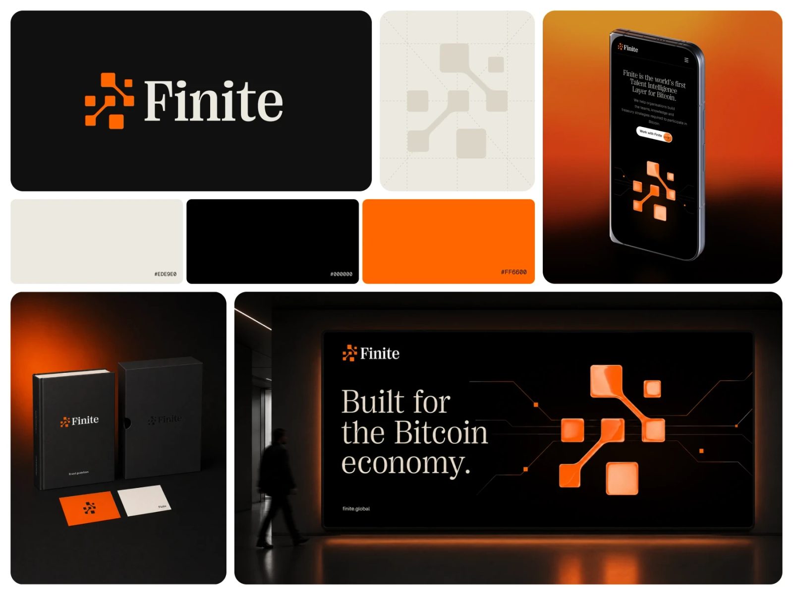
Finite’s network motif grew from its role connecting people, companies, information and capital. Its existing symbol became the centre of that network. Angular paths, square nodes, portraits and orange pulses developed into a recognisable system across the website and brand materials.
3. Make expertise easy to assess
Give buyers material they can use to judge the business: named people, relevant experience, clear service scope and useful articles. Put that evidence near the claims it supports. A polished visual identity helps present the information; the information itself must carry the case.
Finite’s Insights section gave the founder a place to publish knowledge with authorship, dates and topic filters. When planning a similar site, agree who will write, review and maintain that content before adding a large resource section.
4. Give motion and interactive tools a purpose
Use motion to explain a relationship, guide attention or show a change. During review, check whether the message remains understandable when the animation is still, and whether the essential content is easy to read on a phone.
Finite’s founder suggested a hiring-credit calculator for prospect calls. It became a focused demonstration of how Bitcoin-denominated credits change in fiat value under different price assumptions. Its usefulness came from answering a real question in a sales conversation, with both upward and downward scenarios visible.
5. Match the enquiry path to the visitor’s intent
A contact form should help the next conversation start in the right place. A company looking for advisory support and a candidate submitting a CV have different needs. Separate those paths and ask only for information that helps the recipient respond.
Finite’s broader “Work with Finite” call to action reflected the range of its services. Candidate registration had a separate flow with CV upload. These small structural decisions help the interface match the actual business.
6. Connect the website, content and sales materials
Map the next step after someone reads a service page. A case study can show the work in context, an article can answer a detailed question, and a company brochure can support an internal discussion. Use consistent language and design across those materials so the buyer can follow the same story.
For search visibility, connect relevant pages with descriptive links and publish specific, useful explanations grounded in your experience. Google’s guidance emphasises helpful content and links that people and search engines can understand. This supports discovery; it does not guarantee rankings or enquiries.
Google’s helpful-content guidance
Turn the brief into a coherent website
Before choosing layouts, agree on the audience, the services they need to understand, the evidence you can show and the next action you want them to take. Those decisions give the design a job to do and make feedback much more concrete.
AGR Studio brings brand strategy, website design and development into one process. Explore the Finite case study for the finished work, or tell us about the Bitcoin or financial business you are building.
Blog