One story, told by the members
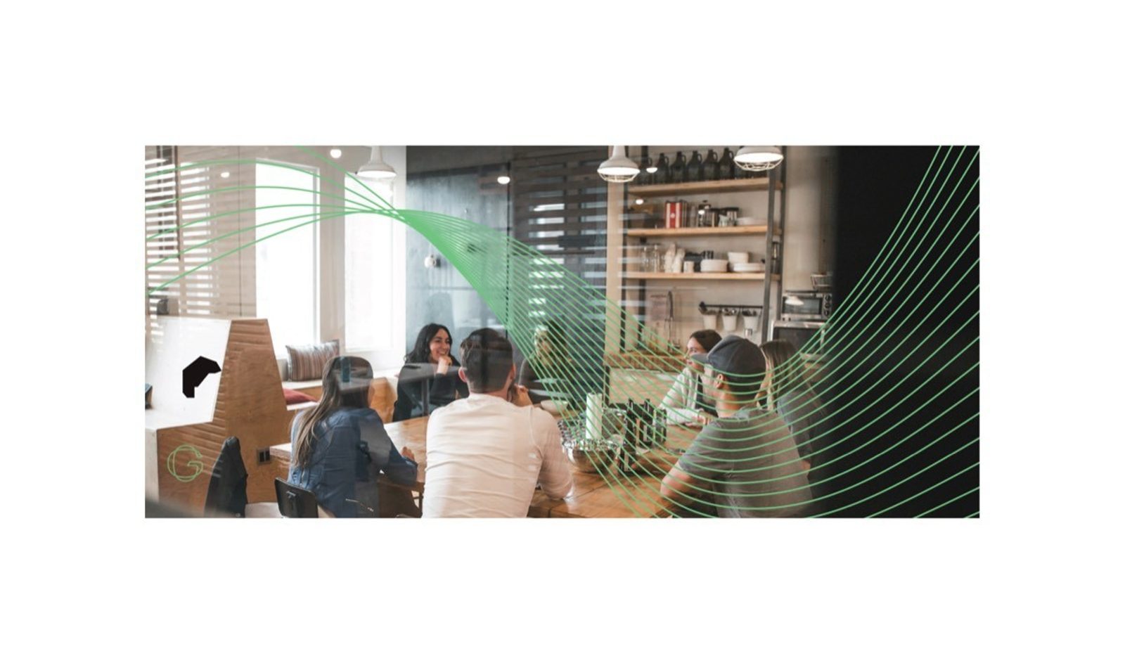
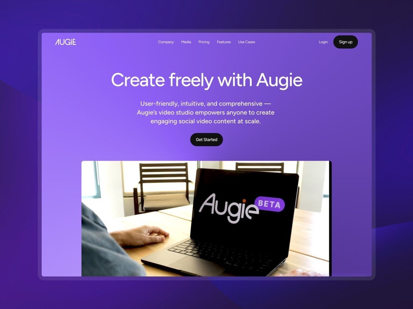
We pulled those scattered pieces into a single narrative on the homepage that showcases membership from outcome to price, with deep-dive pages for anyone who wants more before committing. The web design balances ambition with credibility: a warm palette with green accents, chosen deliberately for growth, and real member photos with specific results instead of generic praise. It feels like an ambitious professional community, not another online course platform.
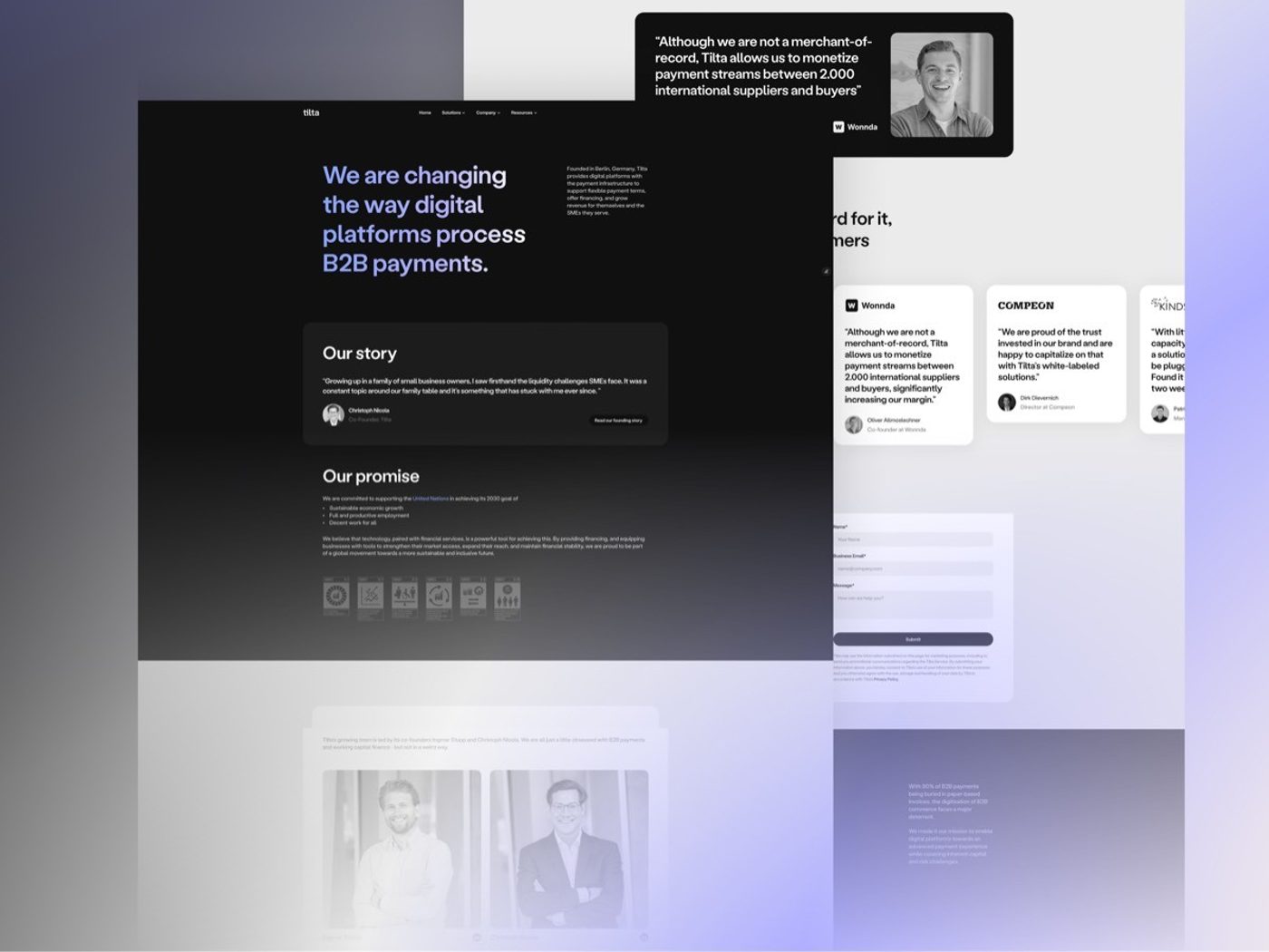
Testimonials sell membership better than anything, so the Framer development centers on a CMS-powered social proof system. One library feeds featured quotes on the homepage, detailed stories on a dedicated page and short quotes next to the programs they speak to, and each one links to the member's LinkedIn profile, a trust signal generic review widgets can't offer. Form integration and analytics follow every step of the path to sign-up.