Making insurance feel human, clear, and trustworthy
Client
Stand Insurance
Industry
Insurance / Fintech
Services
Web Design, Framer Development, Lead Generation, Quote Integration
Tech stack
Framer, Form Integration, CMS, Analytics
Year
2024


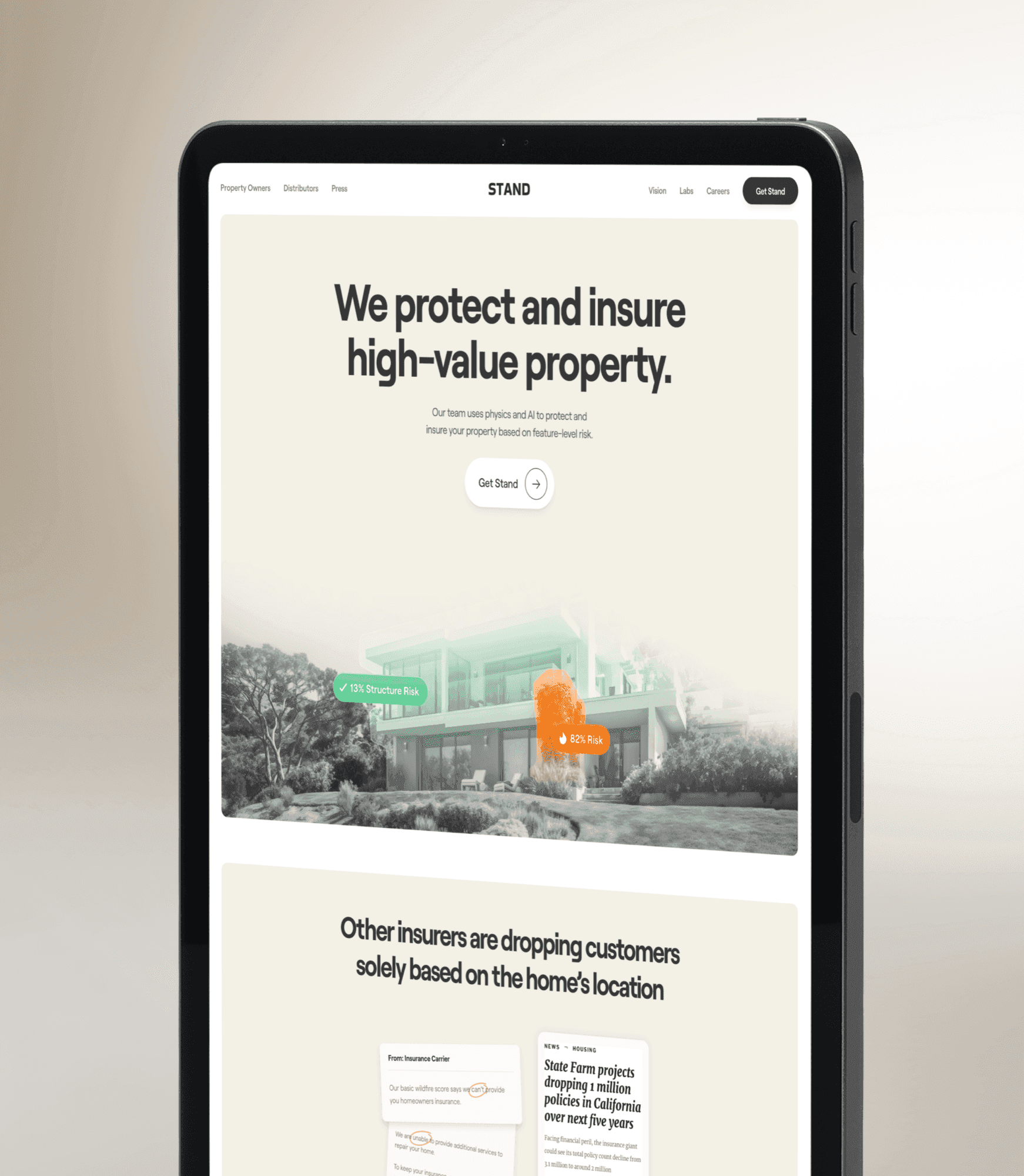
How AGR Studio redesigned Stand Insurance's website in Framer with a warm, approachable design and a multi step quote flow that simplifies complex products.
Stand Insurance is a modern insurance provider on a mission to make coverage straightforward. Their previous website suffered from the same problem as most insurance sites: dense jargon, confusing product matrices, and a cold corporate aesthetic that made visitors feel like they were reading a legal document rather than shopping for protection.
The redesign brief was clear: make insurance feel like something people want to engage with, not something they endure. Simplify the products, warm up the brand, and create a path from "I need coverage" to "I've got a quote" that takes minutes, not hours.
Simplification Strategy
Insurance products are inherently complex, but the complexity should live in the policy, not the website. We audited Stand's product lineup and worked with their team to distill each product into three layers: the headline benefit (what it does in one sentence), the key features (what's included), and the detailed terms (expandable for those who want depth).
This progressive disclosure approach means 90% of visitors get what they need from the first two layers, while the detail-oriented 10% can drill down without leaving the page.
Warm Authority
We developed a visual language that balances warmth with authority. Rounded shapes and warm accent colors create approachability. Clean typography and structured layouts project competence. Illustration-style icons explain insurance concepts visually, deductibles, coverage limits, claim processes, without defaulting to stock photography of handshakes and umbrellas.
Quote Flow
The quote integration is the site's technical centerpiece. We built a multi-step form that feels like a conversation rather than an application: friendly questions, progressive input, and real-time feedback. The form adapts based on answers, homeowners see different questions than renters, businesses see different options than individuals.
Every form interaction is tracked through analytics, identifying exactly where prospects drop off. This data feeds back into UX improvements, creating a continuous optimization loop that improves conversion over time.
Business Results
The redesigned site transformed Stand's digital acquisition. Quote completion rates increased significantly compared to the previous form-heavy approach. Average time-on-site increased as visitors engaged with the simplified product content rather than bouncing from information overload. The warm, approachable design helped Stand differentiate in a market where most competitors look interchangeable.
Multi-Step
Quote Flow
3 Levels
Product Layers
5 Weeks
Timeline